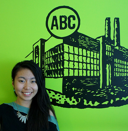
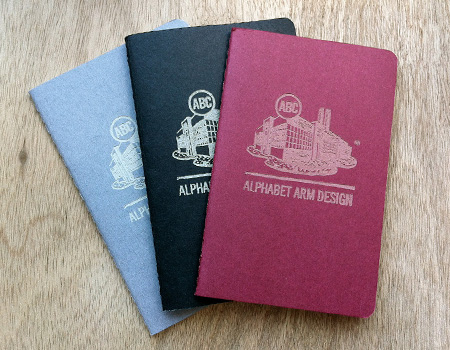
Wow…did this summer fly by or what? I remember my first day here at Alphabet Arm, I was nervous as ever. The guys made me feel like I was apart of the design family in no time. This internship at Alphabet Arm has had a big impact on my life. My perspective on design has strengthened. Even in the first couple weeks I learned more than I thought I would. I am so thankful for Aaron and Ryan to give me the opportunity to intern for them. Being able to experience how a design studio works and actually take on projects for clients was awesome for me to be apart of. Being able to use my photography skills this summer was a big plus. The quality and attention to detail throughout my images look stronger and well-polished. What I will be taking away from Alphabet Arm are my newly improved prepping designs for print skills, my newly installed logo generating techniques, my expertise at designing albums, and many more.
I’m going to miss all the laughs and lunch breaks that made everyday such a fun atmosphere to be apart of. I will miss our breaks to watch Dr. Steve Brule inform us with his rules(…For Your Health), myself and Ryan’s deep conversations on what should have not been changed in the special edition versions of Star Wars Episodes 1-3, Jerry and his usage of ketchup, Aaron’s quick statements about how close of a relationship twitter and I should have, and many many many more. Even though I was quite known to space out during conversations and eventually enter my way back in by thinking I knew what they were talking about (yeah…fail on my part), I was always prone to have funny jokes make about me. Getting to work along side intern #2, JerryChant, was the best. We’ve become great friends through this experience and I know that we’ll definitely stay in touch, life after Alphabet Arm.
“Note to self lessons” and goals accomplished here:
1. Apple + y (in illustrator) = very, very, VERY important when designing.
2. Open files FROM the application, DO NOT drag files to icon. CAUTION: will cause computer to take a while to load and Aaron will make fun of you.
3. Become a mastered Sushee-lady…check.
4. Pencil sharpeners must always work effectively.
5. Add more key commands to my memory…check.
6. Rubber Bands create excellent and efficient weapons on defeating enormous flies.
7. Do not leave the table when eating lunch because your food could be tampered with.
8. Take a picture of Ryan without him knowing…CHECK! (See below)
So my fall semester starts early for me and I’m heading down south to Ringling soon. If anyone wants to stay in touch feel free to email me at ngavrilles@gmail.com
Stay fancy Alphabet Arm fans,
-Nicole / cargocollective.com/nicolegavrilles


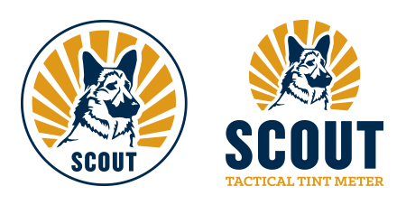
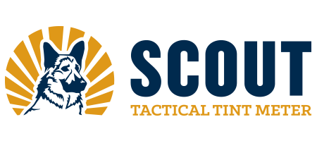 The Scout Tint Meter is an innovative, handheld, new tint reading device developed by a State Trooper.
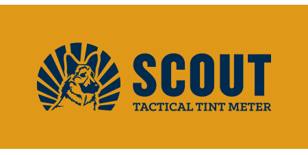


 Better transit. For everyone. We can definitely get behind the tagline of our newest client,


 We’ve worked with Sarah Borges and The Broken Singles on several projects in the past, so we were quite enthusiastic to work on her brand new, solo record. Radio Sweetheart was crowd-funded by her loyal fan base, its chock full of what Sarah does best: well crafted old rock n’ roll with a country twang thrown in to keep things interesting. Sarah got dressed up all-fancy-like and had a photo shoot with her dad’s classic Thunderbird. She turned the photos over to us and it was our job to create a album cover that looked timeless and exuded cool (which Sarah has in spades). We were especially pleased to find a light-hearted image of Sarah behind the wheel with a candid laugh, it took some doing to convince her that was the way to go, but we were glad she trusted our instincts. Do yourself a favor, and turn this one up!
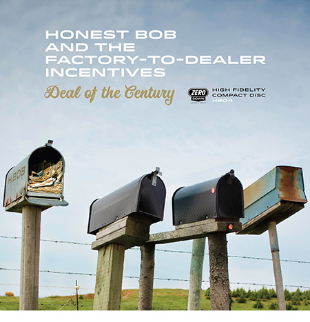 Happy clients, well… make us happy. Honest Bob and the Factory to Dealer Incentives enlisted the studio to develop the art direction for their latest musical offering, Deal of the Century. We had
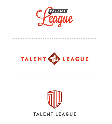


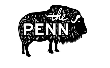
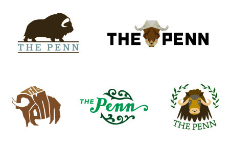
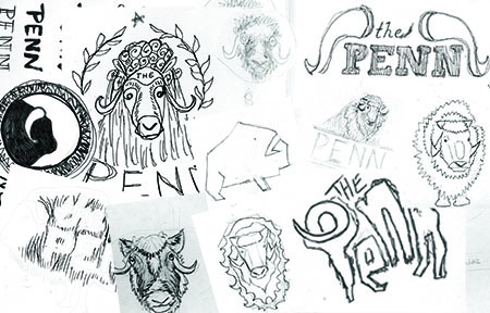
 As a design studio, there are a couple key principles we live and breathe: “Happy clients make the world go ’round“, “Don’t fear the Pantone book“, “Not all typefaces are created equal“, “Never put your hand down a garbage disposal“, and “Measure twice, cut once“.


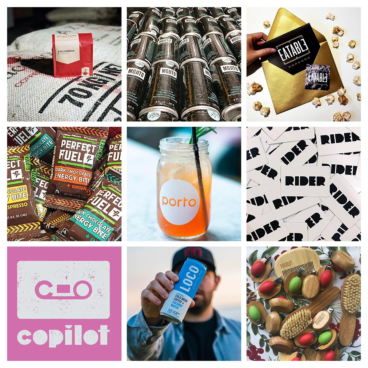
 Over the past month, we have been fortunate enough to develop a logo / branding system for the The Coffee Trike. Founder, owner, and barista extraordinaire Alessandro “San” Bellino is changing the coffee game in Boston by bringing the first espresso tricycle to the States. By combining his love for cycling with his passion for great coffee, he has spawned a truly unique and exciting business. Here at the studio, coffee and bikes are some of our favorite things, so we were very excited to get involved with this project. In developing the logo system, we wanted to highlight the timelessness modernity of San’s idea. The type treatment is stylish, understated, and references old world typography without being dated. The icon set clean, direct, and emphasizes the two most important parts of the business. Keep up with San on Twitter @thecoffeetrike to find out when he’ll be pulling espresso in your neighborhood.


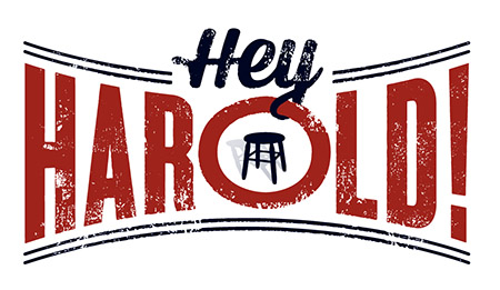
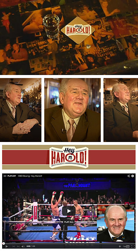
 Oh, this screenshot you ask? It’s a long story, but this


 The Logolounge Master Library Vol.4 (Type + Calligraphy) was just released and we’re incredibly proud to announce the esteemed editors (Ken Barber, Bill Gardner, Jessica Hische + Miles Newlyn) included a boatload of our logo designs in the book. Don’t believe us? See the index image below! We are always honored to have our work included in any volume of a Logolounge collection, but the Master Library book series feels extra special! It’s a great resource and form of inspiration for any designer, order one for


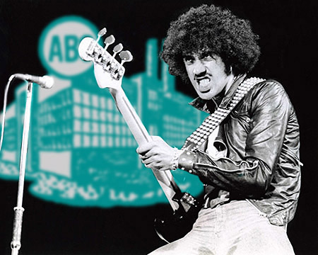
 All around bad-ass MC, Mr. Lif, just hipped us to the fact that he is repping Alphabet Arm in a new Thievery Corporation video for “
 Longtime friend of the studio, Fred Eltringham, is also looking razor sharp in one of our


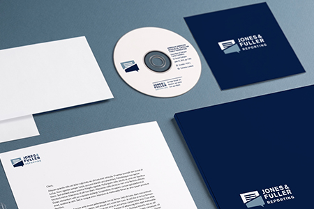
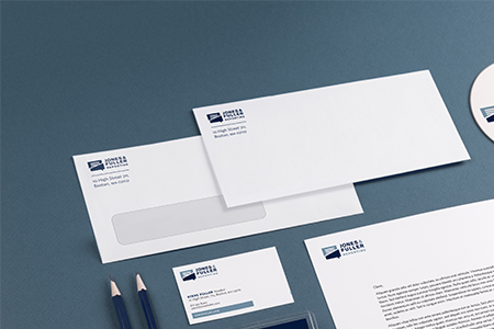
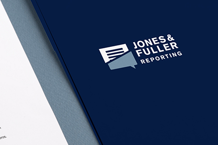
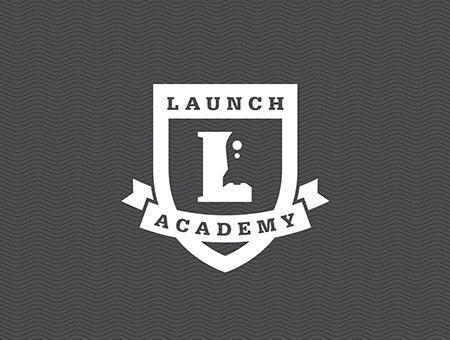
 We worked with word-of-mouth marketing experts,


 We are currently designing die-cut business cards, overarching branding, signage and consulting on the exterior of the shop front. Stay tuned to www.loottheshop.com for it’s anticipated opening. Stop by and see Leo if you find yourselves in Turners Falls.


 I have to say it – Alphabet Arm is an awesome studio. I have officially decided that Aaron and Ryan are probably the coolest bosses I could have hoped for, and while they primarily focus their daytime lives on kerning type and debating Pantone colors, they also enjoy other interesting activities such as listening to a variety of good music, eating lamb shank (Ryan) and tofu (Aaron), cracking jokes left and right, scaling the walls of tall buildings, and shopping for bidets. This is all very entertaining for me!


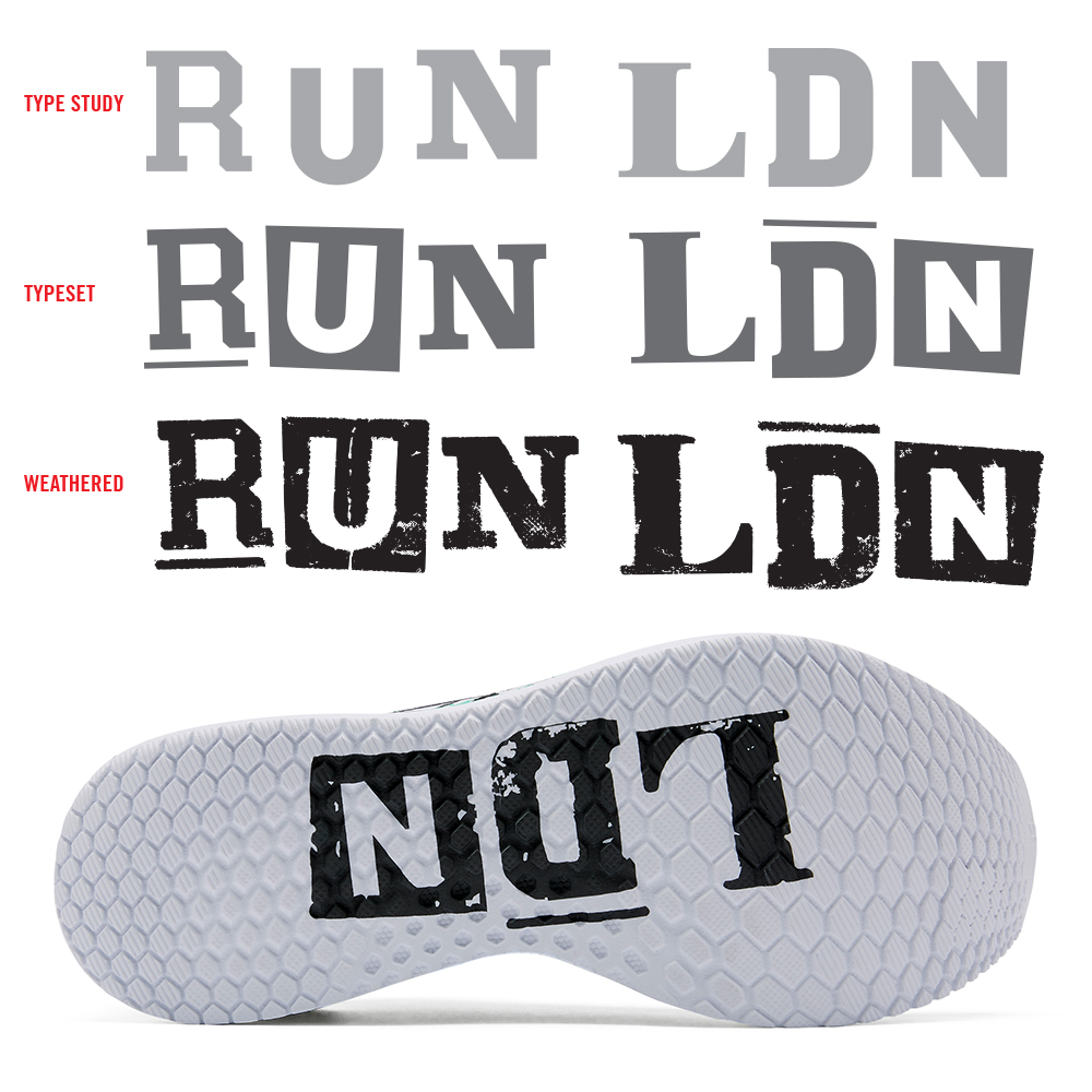
 The Mercury Brewing Company hired us to design the poster for their annual Ipswich Ale “Fall Fest.” We were immediately excited to hear the day’s events included a vintage baseball game played with historically inspired uniforms and mustaches to boot! Alphabet Arm’s pal and all around master illustrator, Alan Pearsall, worked up the image we based the design around. Integrating color and texture to his pencil drawing was an honor. With hopes of perfectly imperfect registration, we lovingly weathering the image. We were also rather inspired by the notion of printing on a wooden crate, hopefully these visual strategies helped knock this one outta the park.
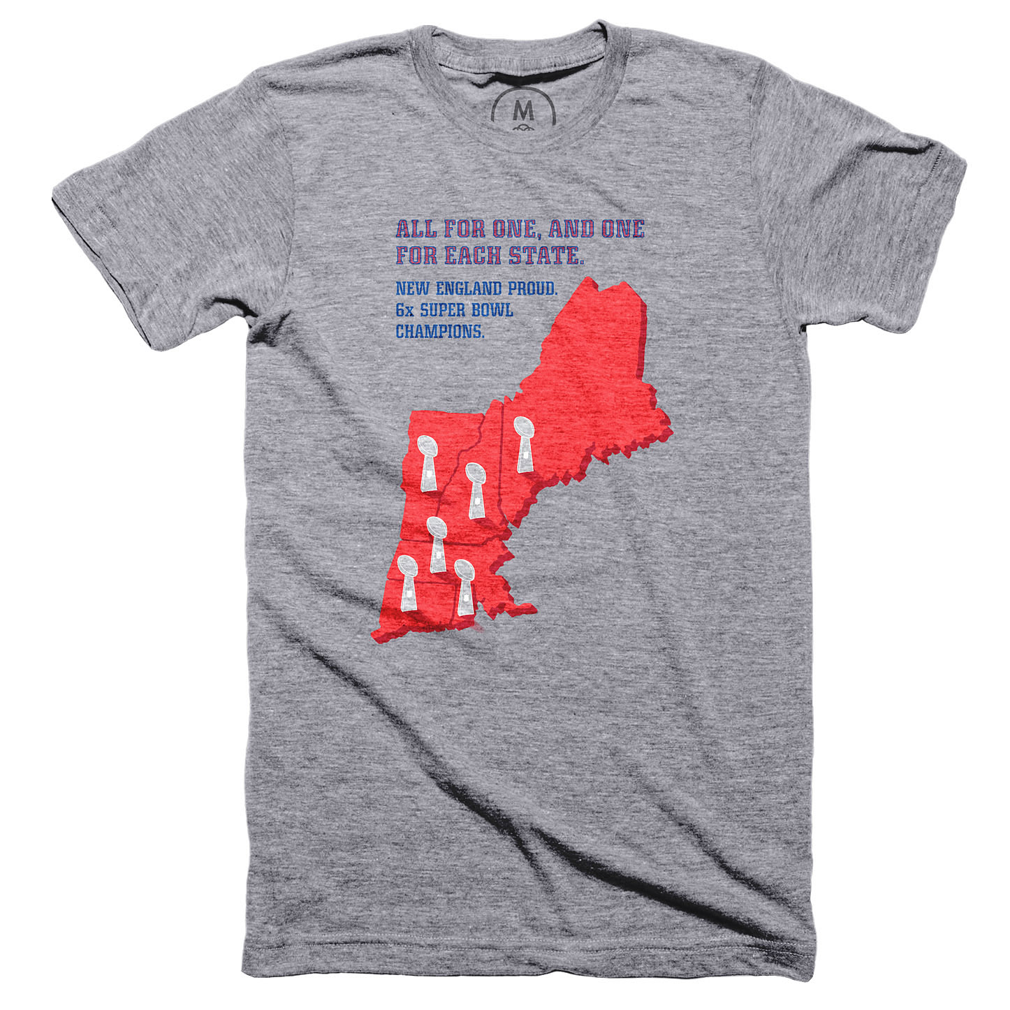
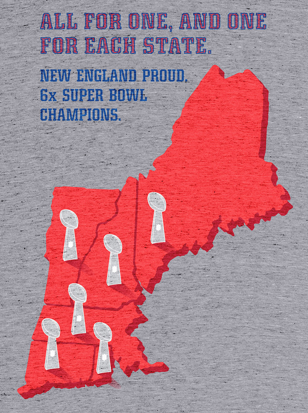
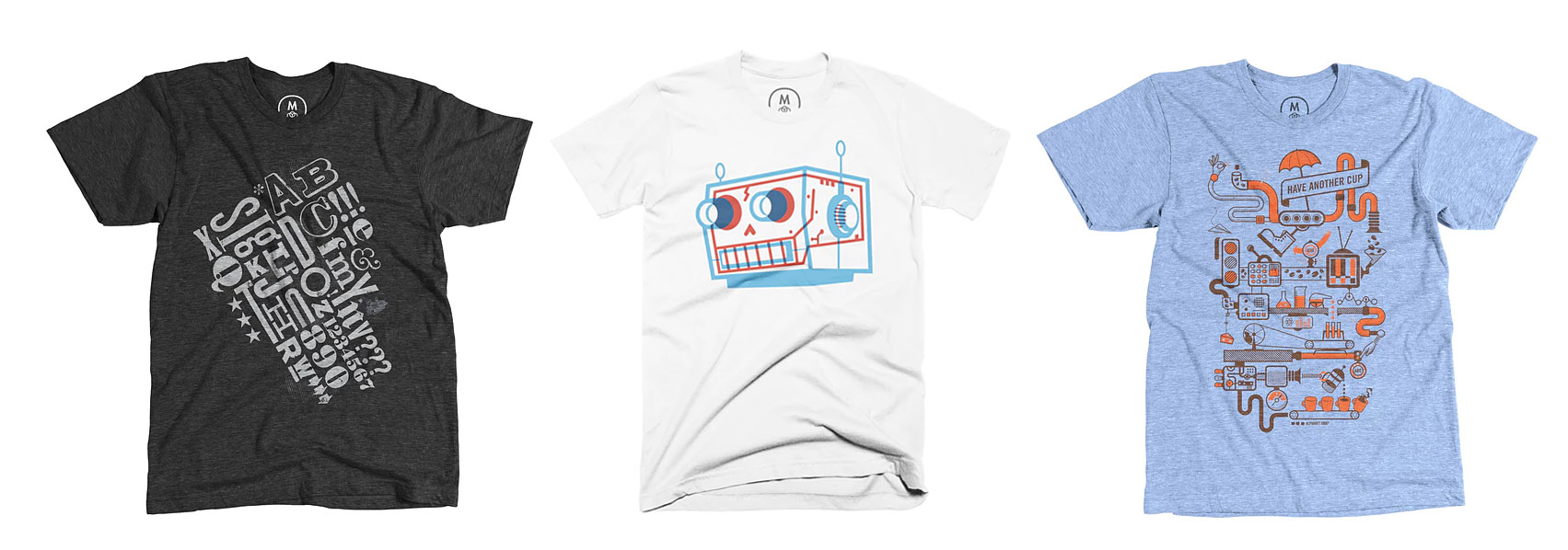
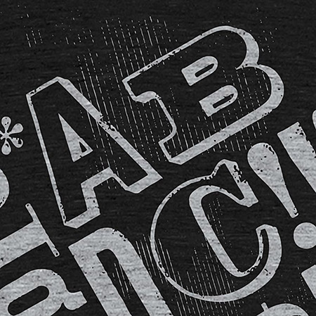
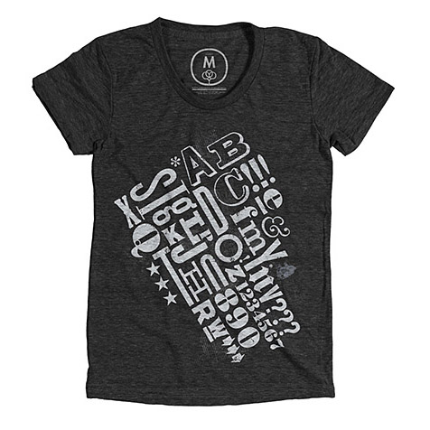
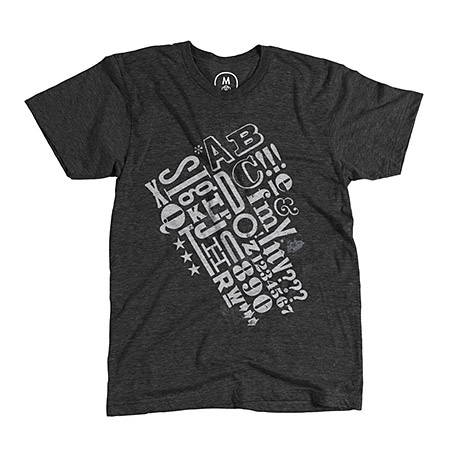
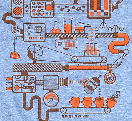
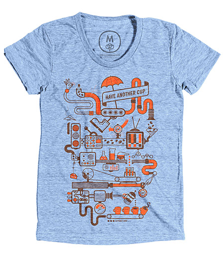
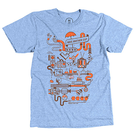
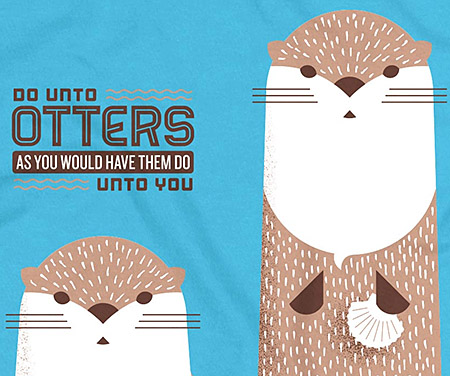
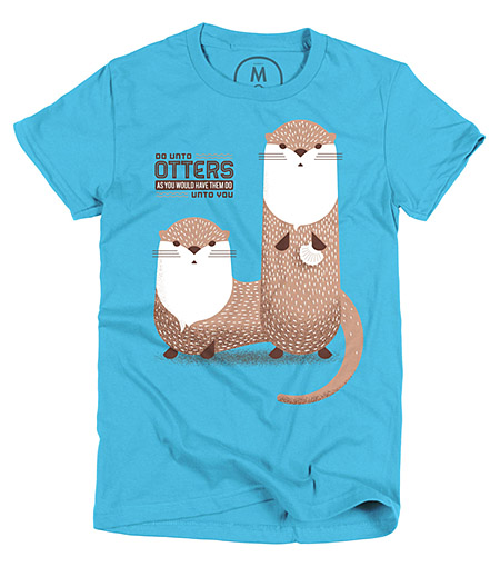
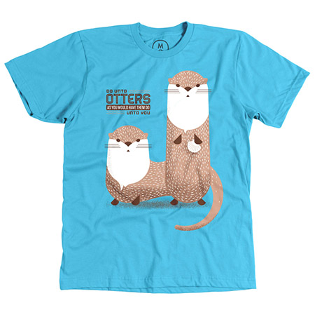
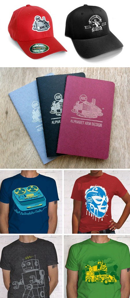
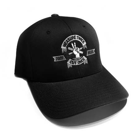
 It’s pretty obvious that we here at Alphabet Arm love music, and that’s why our latest shirt “


 We have had the distinct pleasure of working on a number of projects with the lovely and talented Sarah Borges and her band The Broken Singles. It’s a pleasure, because Sarah embraces the collaborative design process and fully appreciates that we are always looking out for her and her band’s best interest. We’ve consciously established a number of consistent design elements (their logo, typography standards, reoccurring patterns + textures) between all of the band’s releases. Within those standards, we like to vary usage as much as possible and keep the band’s look evolving and their imagery fresh. This live DVD was filmed at a club in Michigan called The Livery. A 100 year prior to it’s current club status, it was a horse stable, hence the branded stallion on the cover! Ride on!


 Show signage")


 Show character detail shot 1")
 Show character detail shot 2")
 Show character detail shot 3")
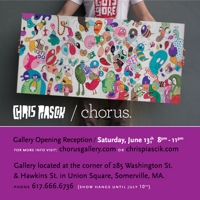


 SHOW character")


")


