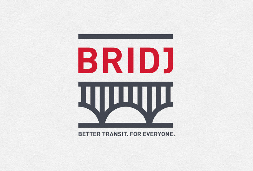


Bridj
Smart Transit System Logo & Brand Design
Better transit. For everyone. We can definitely get behind the tagline of this recent client, Bridj.
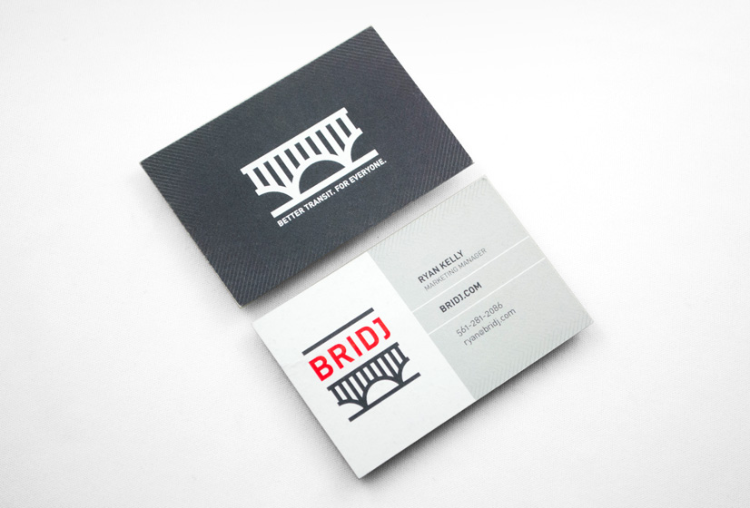
In their words, “Bridj is the world’s first smart transit system which uses big data and awesome shuttles (WiFi!) to adjust to your individual commuting needs.” Our primary intent, when starting the design process for the Bridj logo, was to create a mark that read cleanly and distinctly at both very small sizes (on a smart phone) and very large sizes (on the side of a bus). We feel the logo achieves this legibility with a bold sensibility and clean lines that suggest a sense of classic modernity. Not to imply that the design was easy, but the final mark looks remarkably like the very first sketch we did. Throughout the entire process, this mark seemed to lead the pack and just simply felt “right.” BackThe first thing I needed to do upon joining Bridj, was to replace the freelancer-designed logo with one designed by the best team in the business, Alphabet Arm. The resulting logo and brand guidelines are exactly what we wanted as we were starting to generate a great deal of press and our image was critically important. As has always been the case when dealing with the team at Alphabet Arm, they worked efficiently and delivered high quality work.
Des Pieri President and COO, Bridj