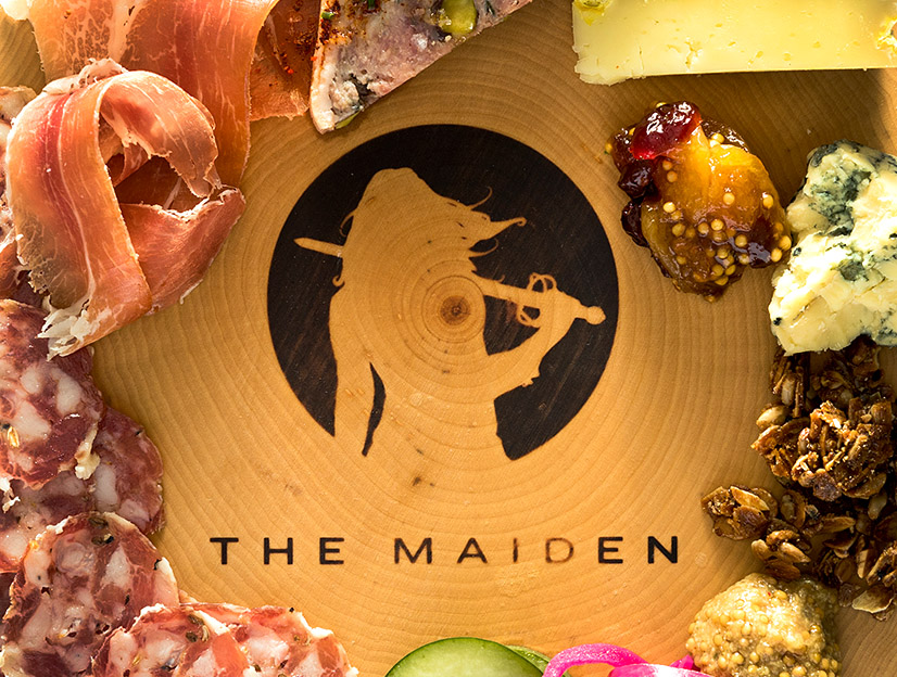
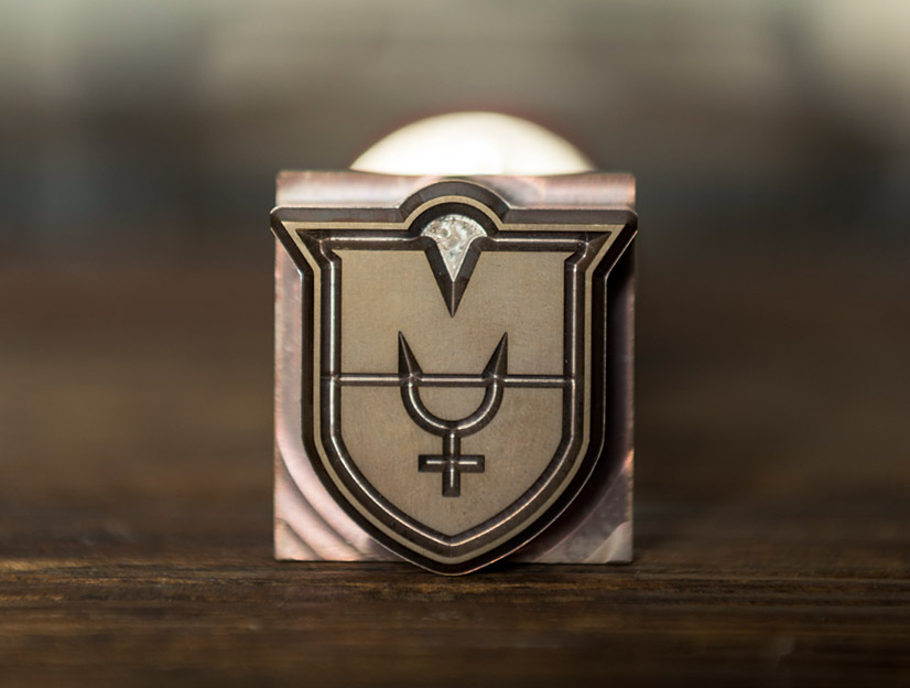
The Maiden
Restaurant & Bar
Visual Identity & Branding
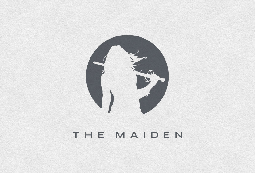
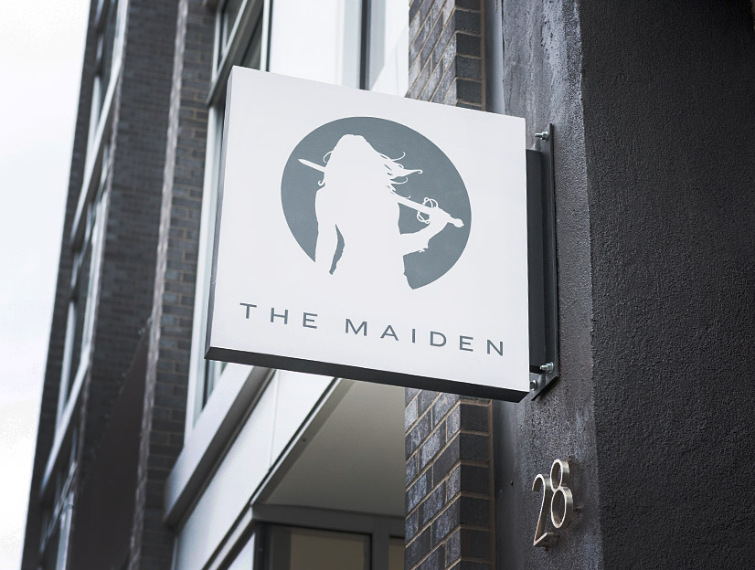
"She’s not here to fight your battles; rather she’ll show you how to swing the sword."
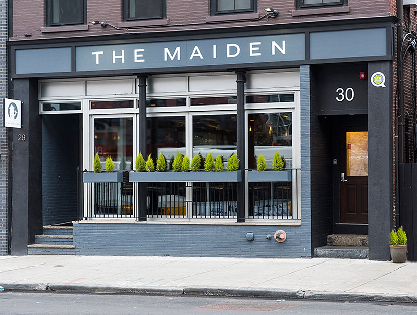
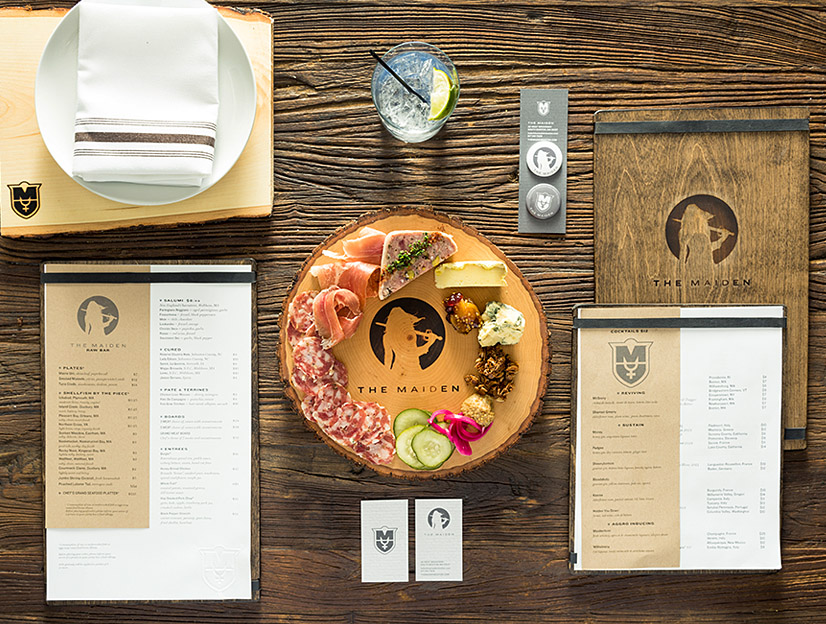
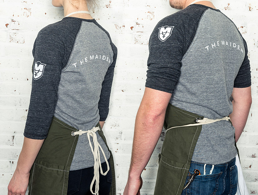
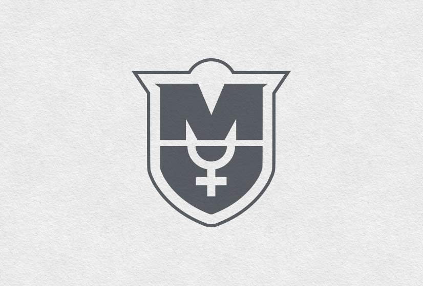
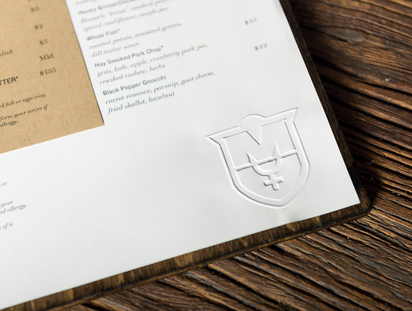
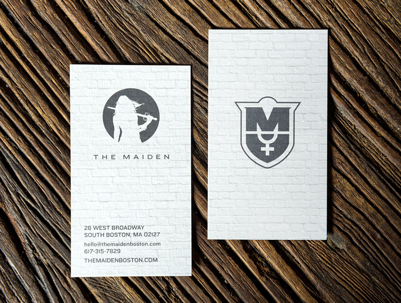
The Maiden is causing quite a stir in South Boston. The restaurant sibling to Sam’s at Louis (soon to be re-opened as Sam’s), The Maiden features an intoxicating array of charcuterie and cheeses, raw bar specialties, and an in-depth drink menu that ranges from good to evil & lawful to chaotic. The co-owners had a very clear vision of how they wanted to craft the menu and dining experience – hiring Alphabet Arm to craft the visual identity & branding was step one. Creating the appropriate heroine to represent the restaurant and concept was critical. She needed to be fierce and fantastically feminine. Early on it became clear that there may be instances where we would want to employ an additional branding tool beyond our beloved heroine. An iconic shield morphing the female symbol and M felt like an ideal solution. With the logo completed, Alphabet Arm began work on the exterior signage, office materials, staff uniforms and the menu design. Do yourself a favor and get to know her.
BackAaron is an artist of principle and vision: though he will go out of his way to ensure that the needs of your project are met, he isn't shy when sharing his viewpoint from a designer's perspective nor is he short on ideas and innovations for expanding the depth of your brand.
Jon Parsons
Co-owner of The Maiden