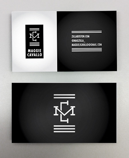
We recently had the dubious honor of working with long-time-friend-of-the-studio, Maggie Cavallo. Maggie is a proud bay state based curator who needed a bit of personal branding for her various endeavors. Maggie’s exhibitions are typically performance based and focus on elevating underground / alternative subject matter to a fine art atmosphere. When it came to designing her logo, we wanted to create a logo that had a refined feel with a definite edge. The custom “M” and “C” letterforms framed by a system of bars offer a decidedly alternative feel, and might relate to yet another one of her creative passions (stay tuned here for more regarding that). The black and white color scheme and Futura Condensed Bold elevate the logo for a gallery setting.

When it came to designing her business cards, we thought long and hard about incorporating a tertiary color. In the end, we decided that the strong contrast of the black and white had an elegance and punch that was appropriate for the fine art world. Word up.