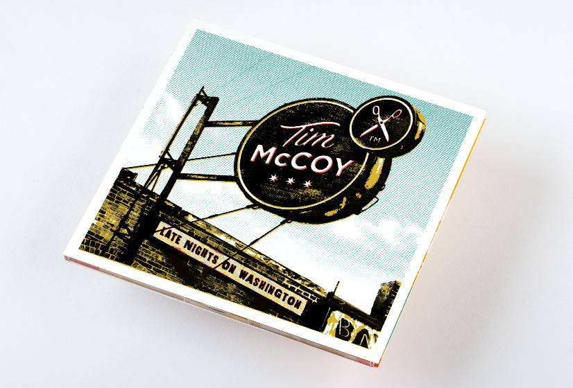
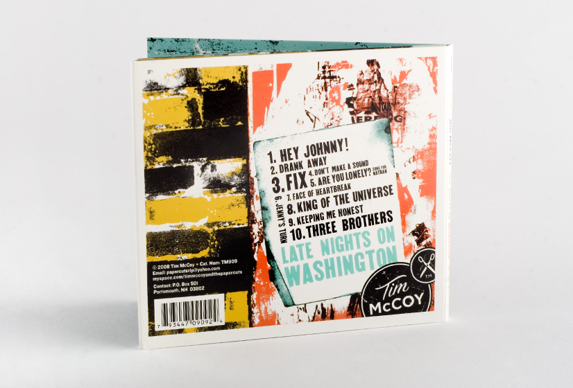
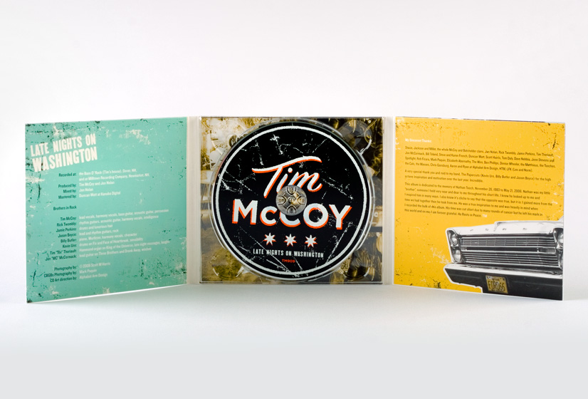
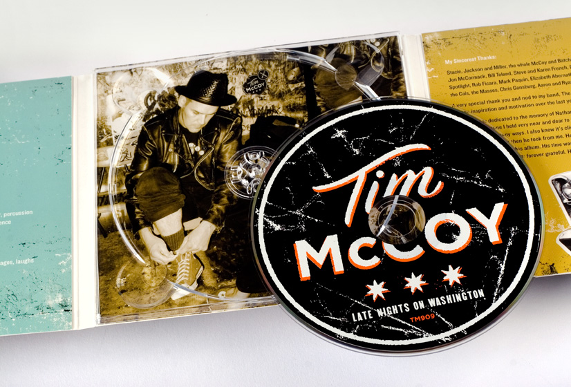


Tim McCoy and the Papercuts
CD Packaging
Late Nights On Washington
Tim McCoy is a helluva guy. We’ve had the pleasure of working with Tim and his many bands for years. Currently, he is backed up by The Papercuts, a rock’n roll band that knows their way around the New England scene. We wanted the design to reflect the fact that Tim is a seasoned veteran, not afraid to be a little rough around the edges.
back