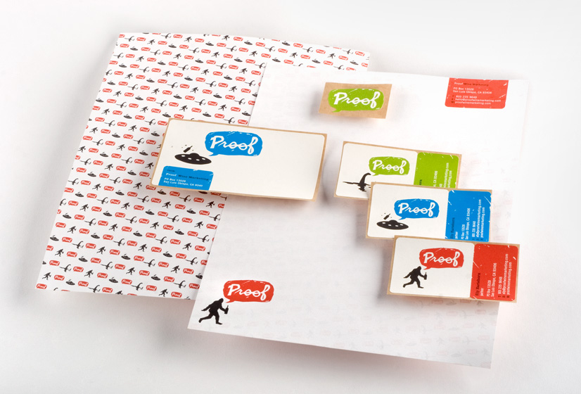
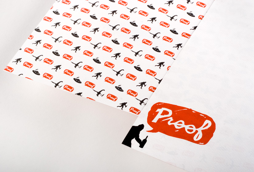
Proof
Wine Marketing
Logo & Brand Design
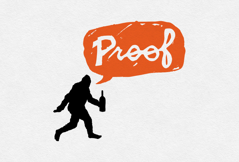
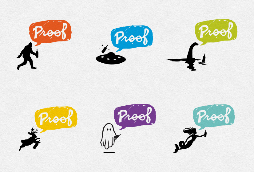
“We’re not sure what kind of imagery we want, but we know it should be unexpected and fun.”
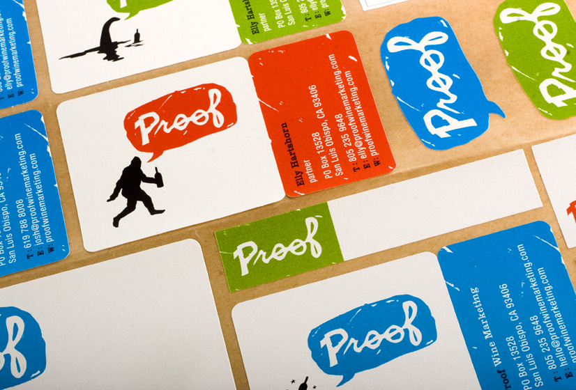
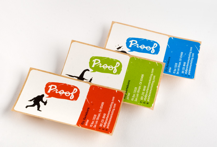
We couldn’t have been more enthusiastic to hear that from the founders of Proof Wine Marketing. The final design solution makes use of a rotating logo family that is comprised of 6 different characters, each with its own corresponding color. Big Foot, Nessy and friends will leave conspiracy theorists searching for “Proof.”
Back