
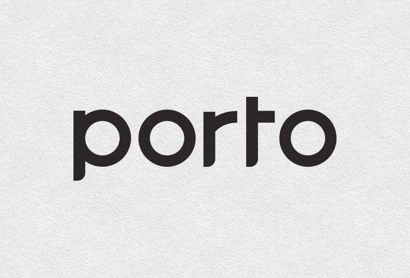

Porto
Restaurant & Bar Visual Identity & Branding
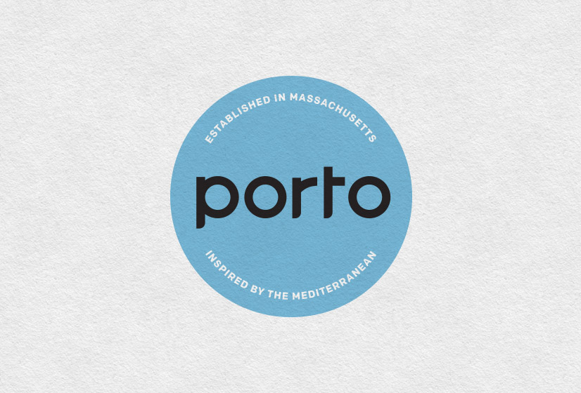
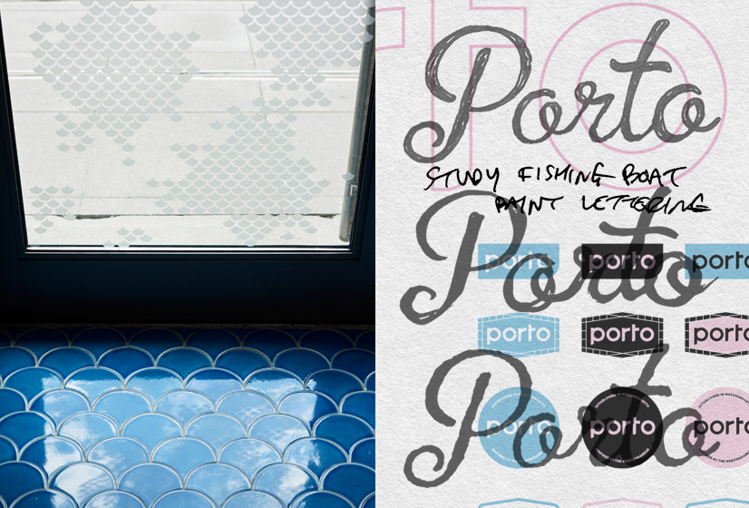
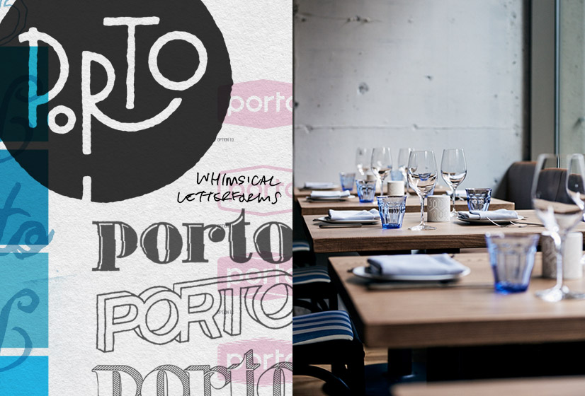
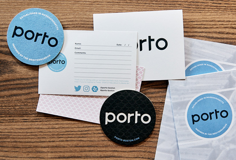
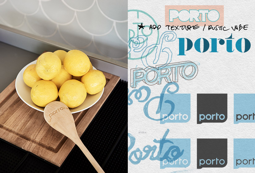
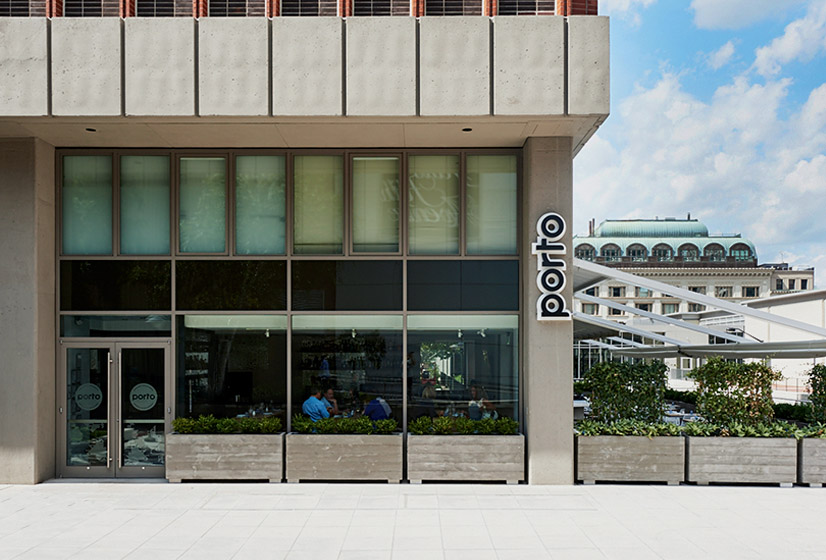
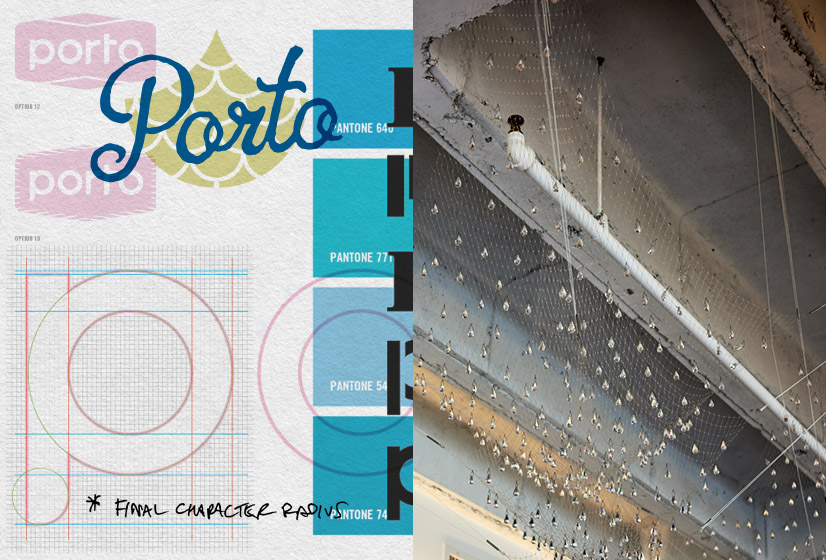
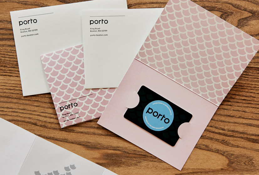
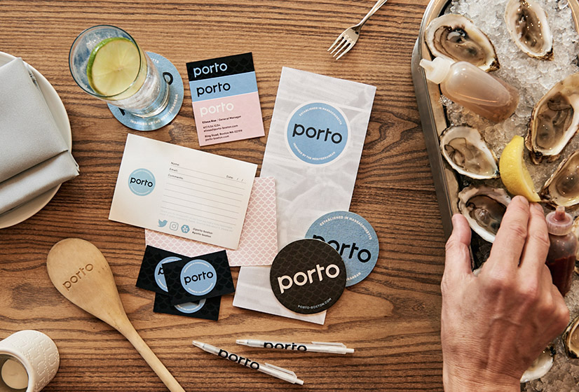
Porto is the latest venture for renowned chef Jody Adams and her restauranteur team of Eric Papachristos and Sean Griffing. Located in the heart of Boston’s Back Bay, the restaurant is already becoming a neighborhood staple. The name “Porto” comes from the Italian and Portuguese word for “port”. That inspiration is reflected in the menu which features Mediterranean seafood specialities with a focus on locally sourced produce and protein. Alphabet Arm was hired to develop the visual identity, branding, exterior signage, menu layouts and branded print materials – even wearing a copywriter hat to pen the restaurant’s tagline – “Established in Massachusetts. Inspired by the Mediterranean”. The cozy, industrial interior features an open kitchen, raw bar and seasonal outdoor patio for café casual fine dining. The initial logo treatments varied from loose, ink brushed scripts - to tight, technical and minimal letterforms. Pulling inspiration from fish scales, the menu concept, fishing boat signage, the geometry of nature, and netting, many design aesthetics were explored. Per usual request, many of those initial design & logo explorations are featured within this portfolio of final images, enjoy! Back
"Working with Aaron was fabulous! Not only is he artistically talented, he also has the client in mind - he goes out of his way to explain each step of the process within design, branding and printing. His vendor recommendations are all just as talented and committed as he is."
Elissa Rae General Manager of Porto